
Week 1
July 25 - July 28
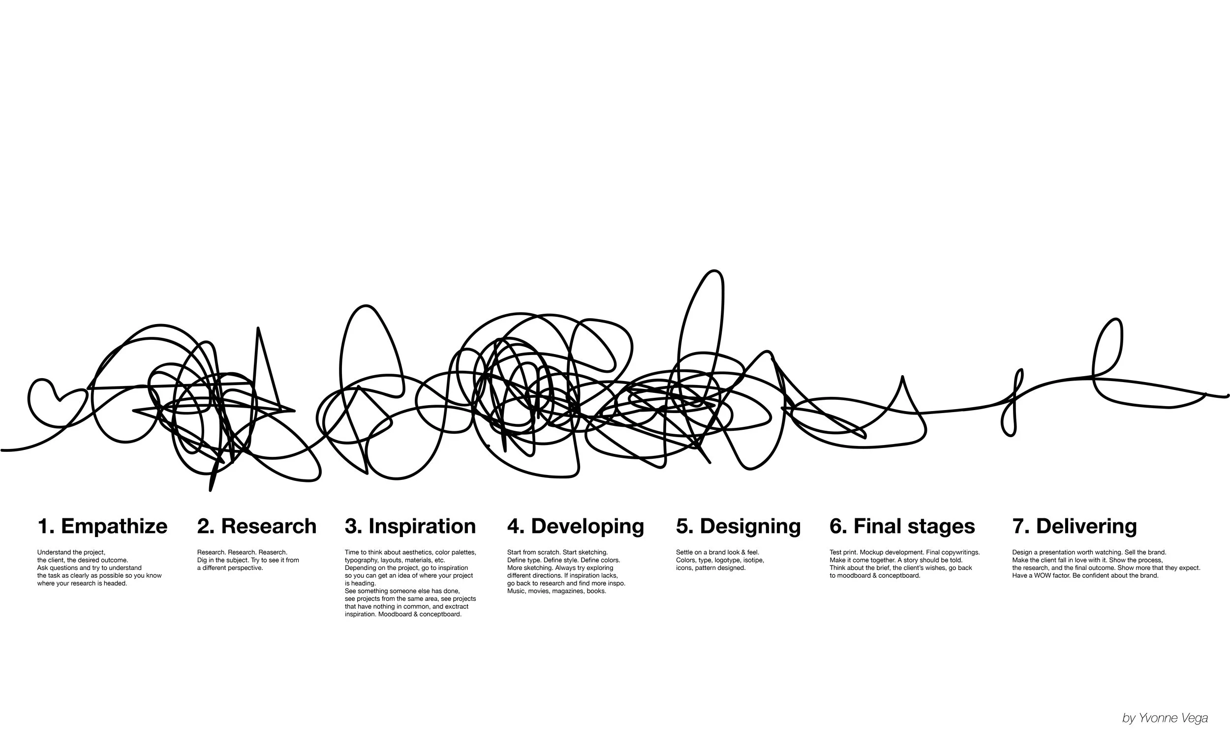

Design process
For the first brief, we were asked to share our own design working process.
This exercise enabled me to think deeply about my own way of delivering a project or a brief and get to know different ways of doing it by listening to my classmates.


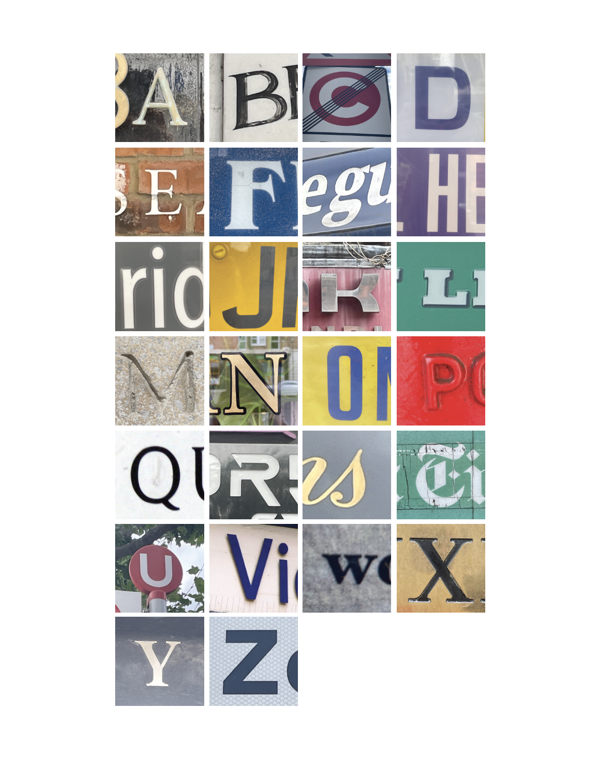
Navigating Cities- Vernacular Type
For this brief, we were asked to get out in the streets and seek all 26 letters of the alphabet. This allowed me to observe and look deeply at all the different types of typographies, styles, notes, and fonts we pass by daily. Old, new, modern, hand-written, calligraphic, printed, and many more. This exercise inspired me to look around and absorb the magic of type around us.
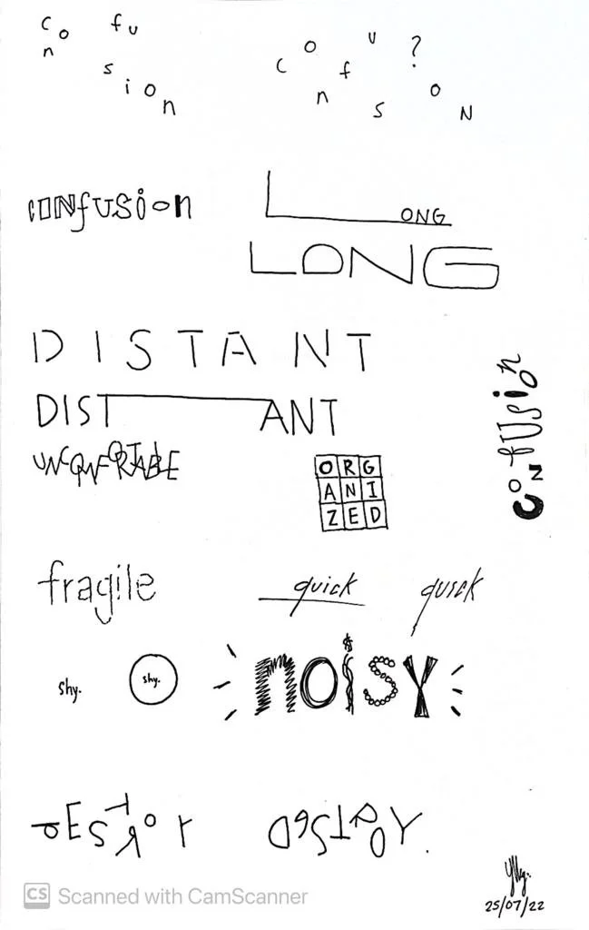
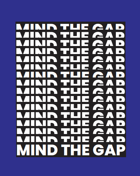
Type Workshop
For this brief, we were given a word list that we had to portray in a typographic way that expressed each one. This workshop allowed me to see the power that typographic design has to express even a single word.
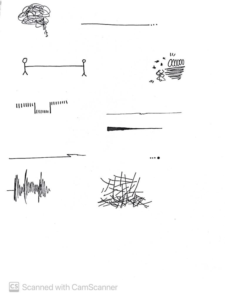
Point Of View - City Voices


For this task, we were asked to listen to and record various conversations, dialogue, and comments that we heard in the streets of London. Listening carefully and recording what was heard as accurately as possible was vital to then reproduce the character of the voice and the conversation. Documenting each dialogue graphically allowed me to find ways of altering type to reproduce an emotion, a sound, and a voice.
As all the conversations I heard took place in London Transport services, I used the colors of such to enlighten each one and express where these took place in a subtle manner.
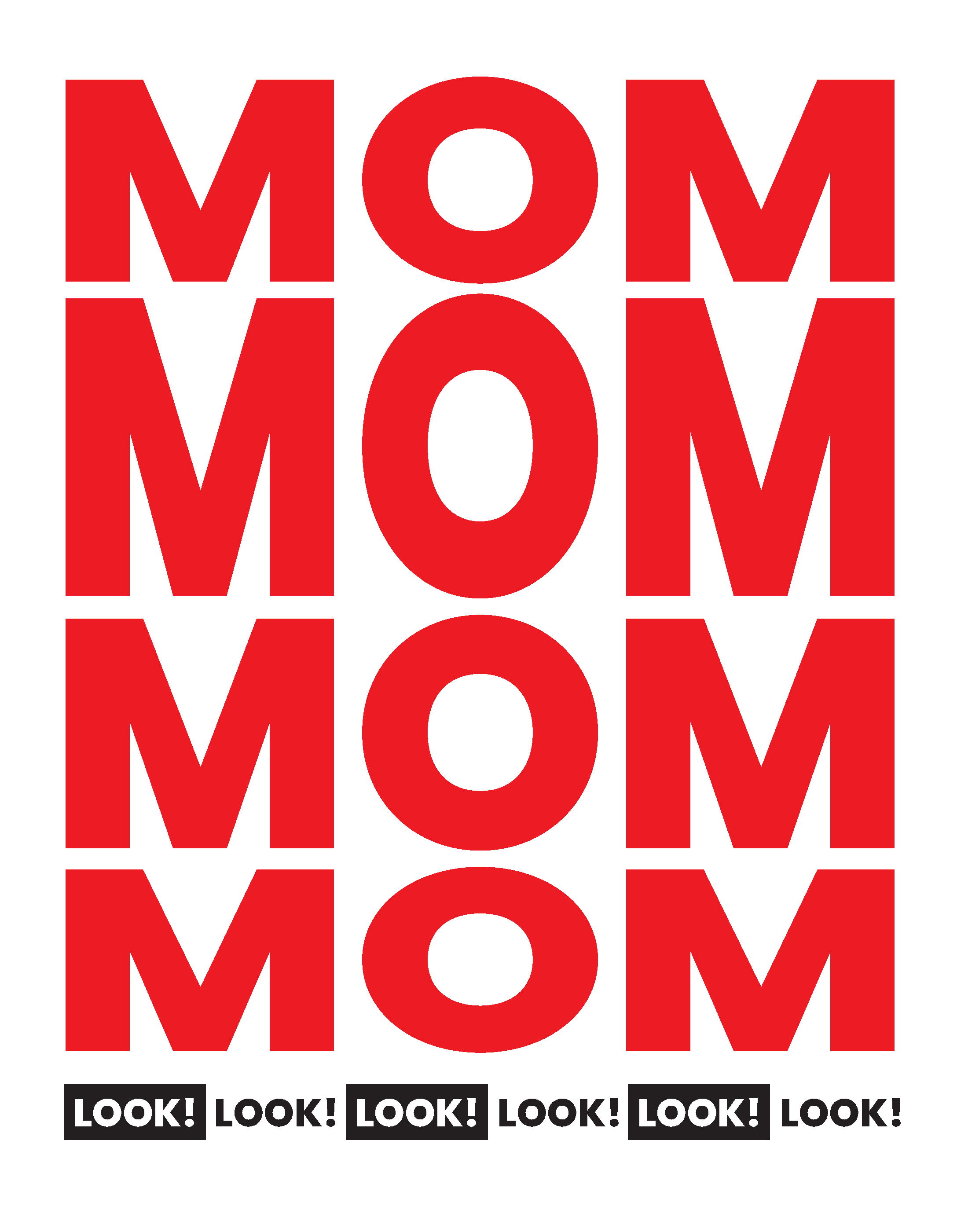
Type Foundry Posters
For this project, we had to choose an existing typography in order to design posters using the chosen typeface and its information as content. Considering hierarchy, composition, and layout was vital in the design process to highlight the family, its traits, and what makes it unique.
I worked with Helvetica Neue, which is a sans-serif font used by millions around the world. Its different weights and styles allowed me to create a collection of posters using only type and a black and white color palette. Minimalism and simplicity were things I highlighted in the posters to refer to the font family itself.


London Museum
London Museum

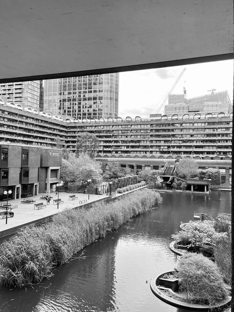
Barbican
Barbican
Mag Culture
Mag Culture
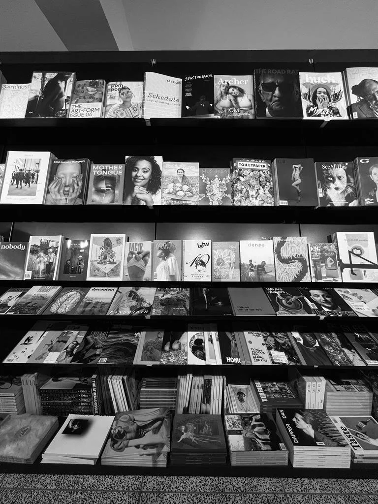
Museum, Barbican, and Magazine Shop
This day was so fun and eye-opening for me. Visiting the museum, the shops, and the Barbican served as a significant inspiration for the final editorial brief. I got to see so many ways of doing things, so many concepts and ideas, and overall it was a very meaningful day for me. This got me ready to start week two on the right track and with a much clear idea about where my project was headed.
